
Explore the art of creating stunning and responsive user interfaces using the power of Tailwind CSS, and how they can be integrated seamlessly into React applications.
Responsive UI design is crucial in today’s web development landscape, and Tailwind CSS offers a revolutionary approach to tackling this challenge. This guide explores how Tailwind CSS, with its utility-first philosophy, streamlines the creation of responsive interfaces.
Accelerating Development with Tailwind CSS
Tailwind CSS’s variety of classes like ‘flex’, ‘pt-4’, ‘text-center’, and ‘rotate-90’ allow for rapid, efficient layout creation directly within HTML. This approach significantly boosts development speed, especially for complex projects and team collaborations.
Tailwind CSS and Responsive Design
Responsive design is a cornerstone of modern web development, and Tailwind CSS empowers developers to excel in this arena. Here’s an in-depth look at how Tailwind CSS facilitates responsive design:
Responsive Modifiers for Flexibility: Tailwind CSS introduces responsive modifiers, enabling developers to apply different styles at specified breakpoints. These modifiers are instrumental in creating designs that adapt seamlessly to various screen sizes, from the smallest mobile device to large desktop screens. This flexibility allows for the creation of interfaces that are not only visually appealing but also functionally robust across all devices.
// With Tailwind CSS
<div class="p-6 max-w-sm mx-auto bg-white rounded-xl shadow-lg flex items-center space-x-4">
  <div class="shrink-0">
    <img class="h-12 w-12" src="/img/logo.svg" alt="ChitChat Logo">
  </div>
  <div>
    <div class="text-xl font-medium text-black">ChitChat</div>
    <p class="text-slate-500">You have a new message!</p>
  </div>
</div>

// Without Tailwind CSS
<div class="chat-notification">
  <div class="chat-notification-logo-wrapper">
    <img class="chat-notification-logo" src="/img/logo.svg" alt="ChitChat Logo">
  </div>
  <div class="chat-notification-content">
    <h4 class="chat-notification-title">ChitChat</h4>
    <p class="chat-notification-message">You have a new message!</p>
  </div>
</div>

<style>
  .chat-notification {
    display: flex;
    max-width: 24rem;
    margin: 0 auto;
    padding: 1.5rem;
    border-radius: 0.5rem;
    background-color: #fff;
    box-shadow: 0 20px 25px -5px rgba(0, 0, 0, 0.1), 0 10px 10px -5px rgba(0, 0, 0, 0.04);
  }
  .chat-notification-logo-wrapper {
    flex-shrink: 0;
  }
  .chat-notification-logo {
    height: 3rem;
    width: 3rem;
  }
  .chat-notification-content {
    margin-left: 1.5rem;
    padding-top: 0.25rem;
  }
  .chat-notification-title {
    color: #1a202c;
    font-size: 1.25rem;
    line-height: 1.25;
  }
  .chat-notification-message {
    color: #718096;
    font-size: 1rem;
    line-height: 1.5;
  }
</style>
Utility-First Approach: Tailwind’s utility-first methodology allows direct control over styling within HTML. This clarity in design leads to an intuitive understanding of how elements respond and adapt across different screen sizes. By using specific utility classes, developers can define styles for various elements that respond dynamically to screen changes, ensuring a consistent and fluid user experience.
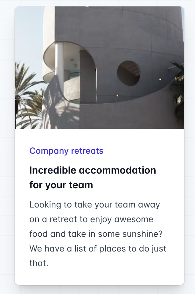
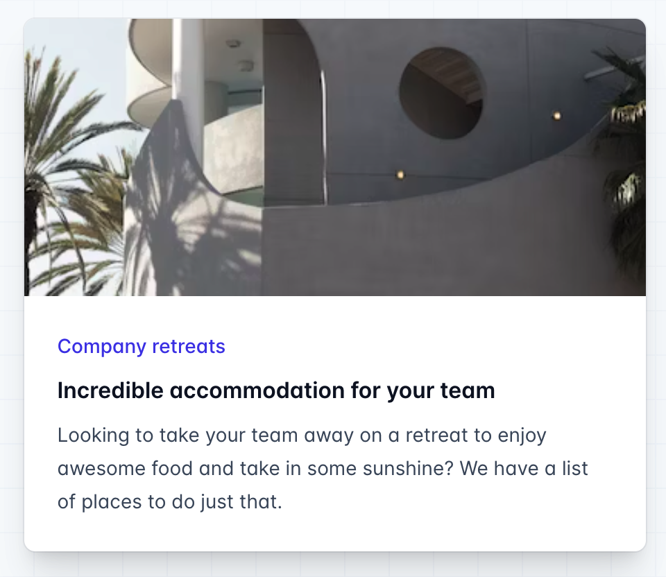
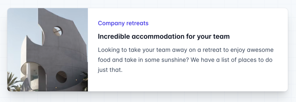
<div class="max-w-md mx-auto bg-white rounded-xl shadow-md overflow-hidden md:max-w-2xl">
  <div class="md:flex">
    <div class="md:shrink-0">
      <img class="h-48 w-full object-cover md:h-full md:w-48" src="/img/building.jpg" alt="Modern building architecture">
    </div>
    <div class="p-8">
      <div class="uppercase tracking-wide text-sm text-indigo-500 font-semibold">Company retreats</div>
      <a href="#" class="block mt-1 text-lg leading-tight font-medium text-black hover:underline">Incredible accommodation for your team</a>
      <p class="mt-2 text-slate-500">Looking to take your team away on a retreat to enjoy awesome food and take in some sunshine? We have a list of places to do just that.</p>
    </div>
  </div>
</div>
Let’s talk. Cloudnonic is here to help you harness the power of custom software solutions to not only catch your audience’s eye but keep it. Pick a time for a free software audit here: Schedule a call with me
Here’s how the example above works:
- By default, the outer
divisdisplay: block, but by adding themd:flexutility, it becomesdisplay: flexon medium screens and larger. - When the parent is a flex container, we want to make sure the image never shrinks, so we’ve added
md:shrink-0to prevent shrinking on medium screens and larger. Technically we could have just usedshrink-0since it would do nothing on smaller screens, but since it only matters onmdscreens, it’s a good idea to make that clear in the class name. - On small screens the image is automatically full width by default. On medium screens and up, we’ve constrained the width to a fixed size and ensured the image is full height using
md:h-full md:w-48.- Example resource: https://tailwindcss.com/docs/responsive-design
Customizable Layouts and Scaling: With Tailwind CSS, developers can create inherently responsive custom layouts. The framework provides a comprehensive set of grid, flex, and spacing utilities essential for building fluid and adaptive layouts. Additionally, the ability to customize color schemes and typography scaling ensures that designs remain consistent and accessible across all devices, enhancing the overall user experience.
/** @type {import('tailwindcss').Config} */
module.exports = {
  theme: {
    screens: {
      sm: '480px',
      md: '768px',
      lg: '976px',
      xl: '1440px',
    },
    colors: {
      'blue': '#1fb6ff',
      'pink': '#ff49db',
      'orange': '#ff7849',
      'green': '#13ce66',
      'gray-dark': '#273444',
      'gray': '#8492a6',
      'gray-light': '#d3dce6',
    },
    fontFamily: {
      sans: ['Graphik', 'sans-serif'],
      serif: ['Merriweather', 'serif'],
    },
    extend: {
      spacing: {
        '128': '32rem',
        '144': '36rem',
      },
      borderRadius: {
        '4xl': '2rem',
      }
    }
  }
}
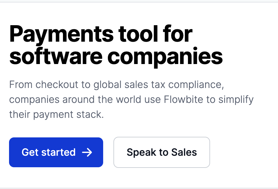
Embracing Mobile-First Design: Adopting a mobile-first design approach with Tailwind CSS is highly effective. This strategy involves designing for the smallest screen first and scaling up, ensuring the user experience is optimized for mobile devices from the outset. With mobile-first design, developers can create responsive websites that cater to the majority of users who access the web via mobile devices, ensuring broader reach and engagement.
<section class="bg-white dark:bg-gray-900">
    <div class="grid max-w-screen-xl px-4 py-8 mx-auto lg:gap-8 xl:gap-0 lg:py-16 lg:grid-cols-12">
        <div class="mr-auto place-self-center lg:col-span-7">
            <h1 class="max-w-2xl mb-4 text-4xl font-extrabold tracking-tight leading-none md:text-5xl xl:text-6xl dark:text-white">Payments tool for software companies</h1>
            <p class="max-w-2xl mb-6 font-light text-gray-500 lg:mb-8 md:text-lg lg:text-xl dark:text-gray-400">From checkout to global sales tax compliance, companies around the world use Flowbite to simplify their payment stack.</p>
            <a href="#" class="inline-flex items-center justify-center px-5 py-3 mr-3 text-base font-medium text-center text-white rounded-lg bg-primary-700 hover:bg-primary-800 focus:ring-4 focus:ring-primary-300 dark:focus:ring-primary-900">
                Get started
                <svg class="w-5 h-5 ml-2 -mr-1" fill="currentColor" viewBox="0 0 20 20" xmlns="http://www.w3.org/2000/svg"><path fill-rule="evenodd" d="M10.293 3.293a1 1 0 011.414 0l6 6a1 1 0 010 1.414l-6 6a1 1 0 01-1.414-1.414L14.586 11H3a1 1 0 110-2h11.586l-4.293-4.293a1 1 0 010-1.414z" clip-rule="evenodd"></path></svg>
            </a>
            <a href="#" class="inline-flex items-center justify-center px-5 py-3 text-base font-medium text-center text-gray-900 border border-gray-300 rounded-lg hover:bg-gray-100 focus:ring-4 focus:ring-gray-100 dark:text-white dark:border-gray-700 dark:hover:bg-gray-700 dark:focus:ring-gray-800">
                Speak to Sales
            </a>
        </div>
        <div class="hidden lg:mt-0 lg:col-span-5 lg:flex">
            <img src="https://flowbite.s3.amazonaws.com/blocks/marketing-ui/hero/phone-mockup.png" alt="mockup">
        </div>
    </div>
</section>
In conclusion, Tailwind CSS offers a robust, intuitive toolkit for mastering responsive UI design. Its utility-first approach, combined with responsive modifiers, customizable layouts, and a mobile-first philosophy, empowers developers to create responsive websites that are both beautiful and functional. Tailwind CSS thus stands as an essential framework for any developer looking to excel in the art of responsive web design.
If you want to deep dive into the benefits of Tailwind and explore its full potential, I recommend visiting Tailwind CSS’s official documentation for comprehensive guides and resources.
We invite you to explore our most outstanding projects developed using Tailwind CSS’s,
Leave a Reply